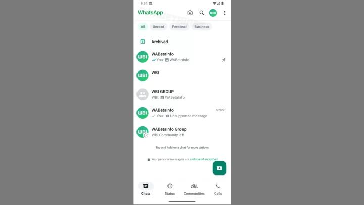
In screenshots shared by WABetaInfo, the top bar, which was previously green, is now white, while other User Interface (UI) elements are displayed in green. The navigation bar appears to be at the bottom.
In this top bar, WhatsApp has also added a new menu for Profile, alongside the camera and search options. This menu will save users time when they want to access their profiles, as they no longer have to go to Settings first.

WhatsApp has not only changed its appearance but has also introduced a new feature for filtering user chats. Located just above the chat list, users can filter them based on unread messages “Unread,” personal conversations “Personal,” or business discussions “Business.”
According to WABetaInfo, this new WhatsApp look is likely a step by Meta to align with the latest Material Design 3 guidelines introduced by Google. However, these changes are not limited to Android and are also visible in WhatsApp Beta for iOS.
It seems that WhatsApp is now aiming to keep the appearance of their application consistent on both Android and iOS. However, it’s worth noting that this new appearance is still in development, so it may take some time to reach the general users. What do you think about this new WhatsApp look?

